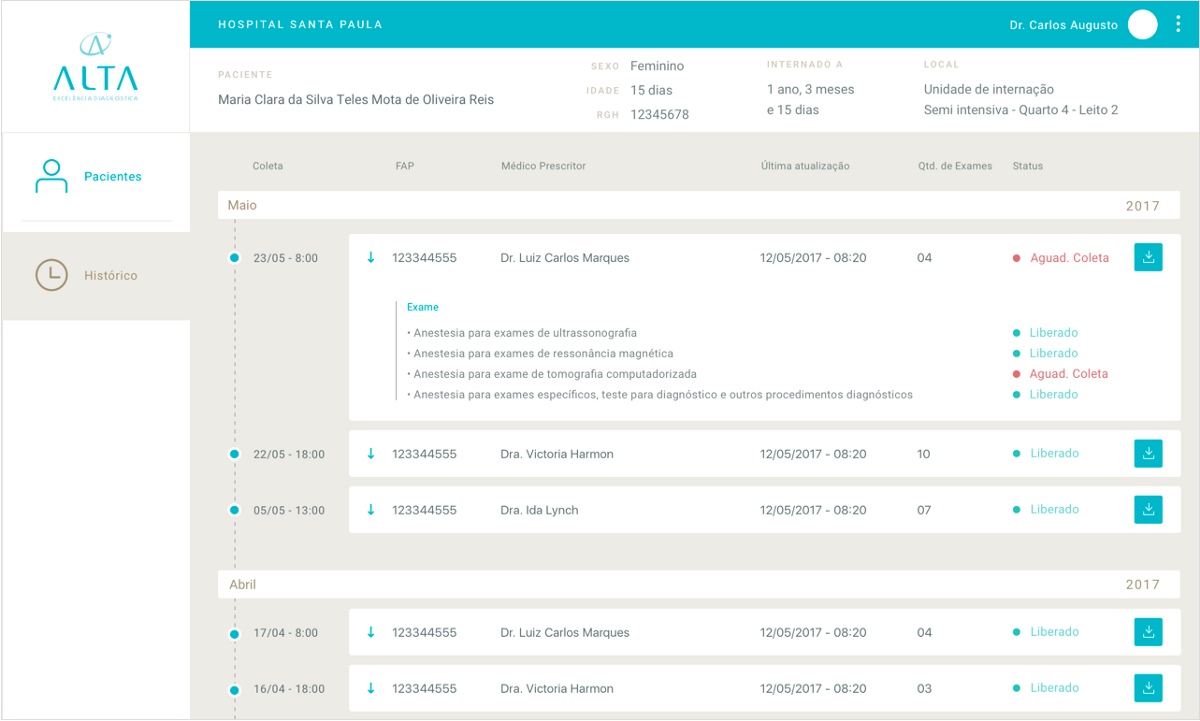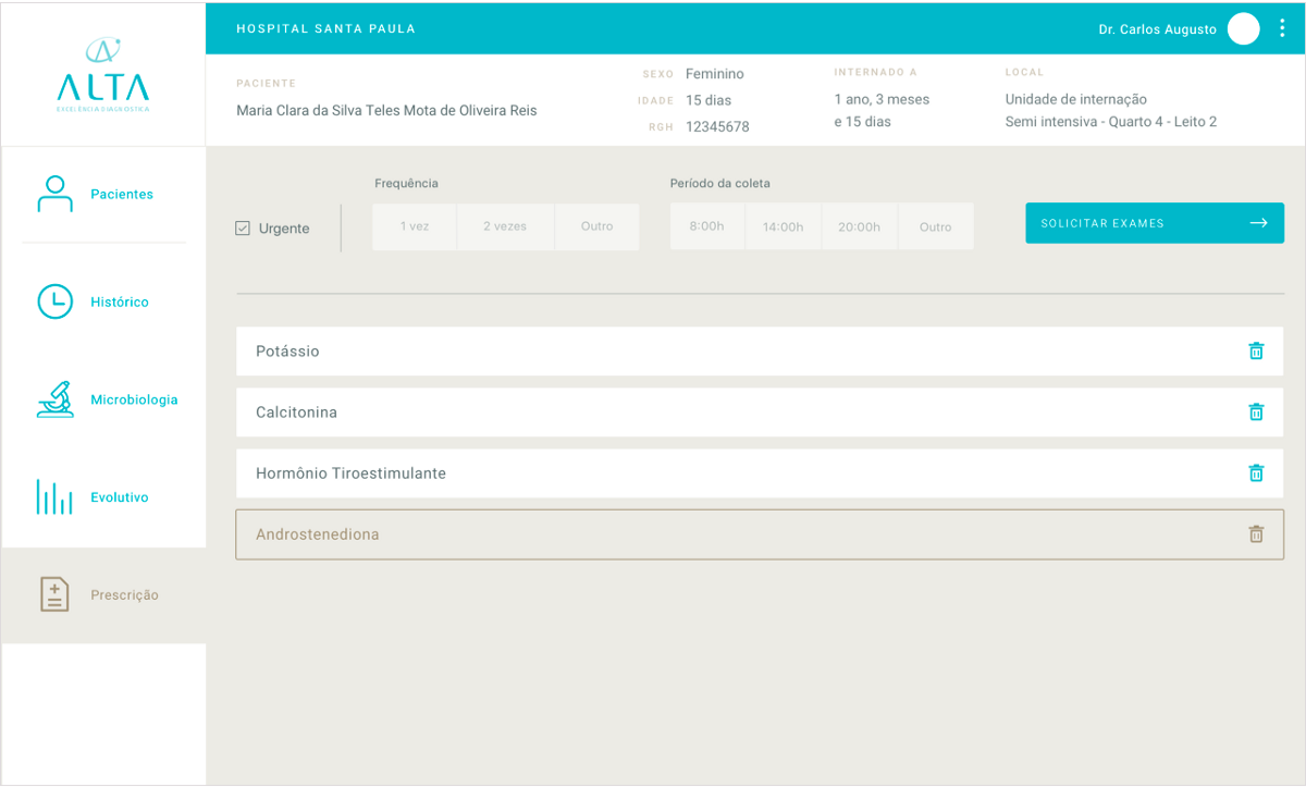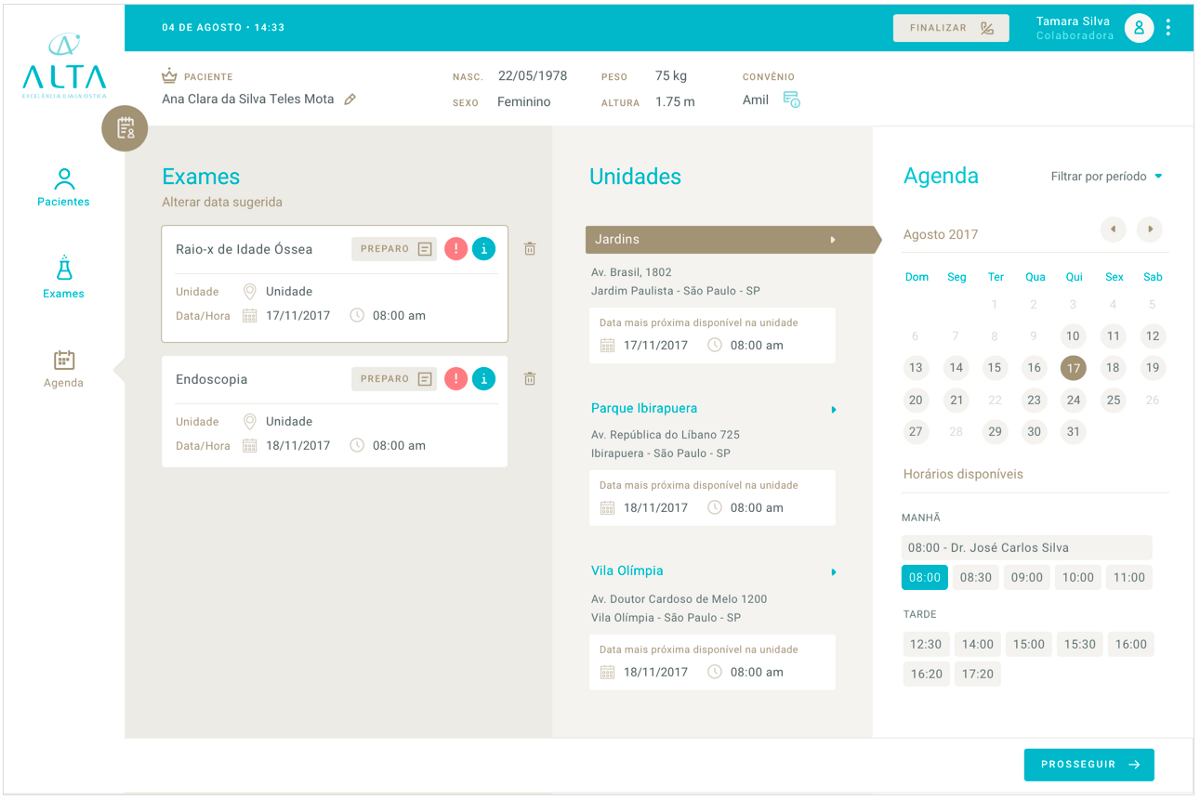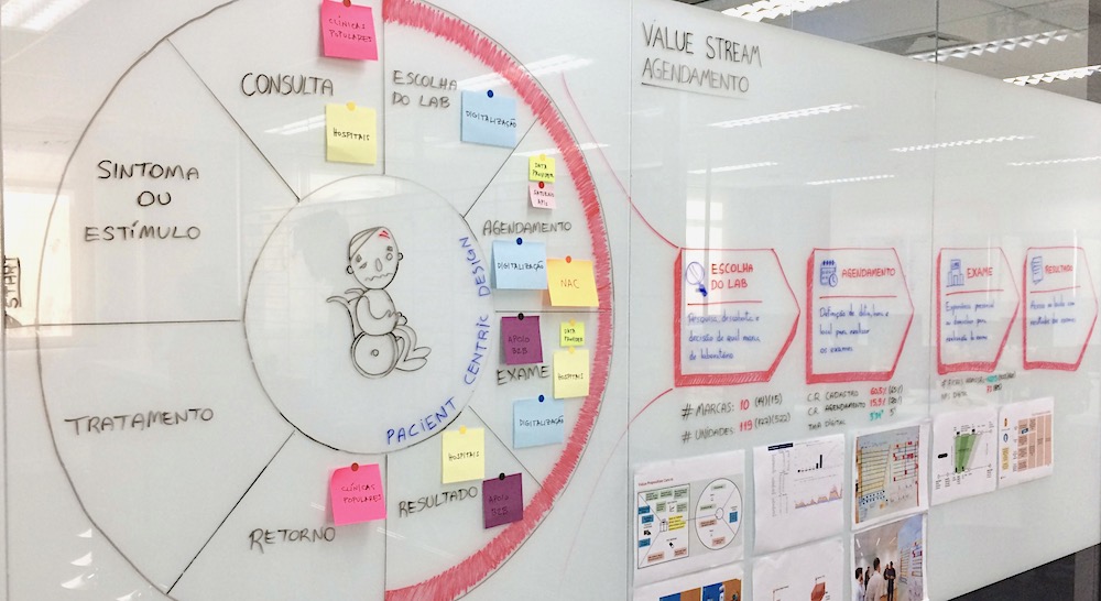
That’s just a glimpse of my work as UX Designer for the largest clinical analyses and diagnostics lab in Latin America.

After almost two years designing experiences for a big player on the healthcare industry, I can say that it has been a long and intense journey.
This journey started when I joined the CI&T design team, and started working on the healthcare industry for the first time.
First mission:
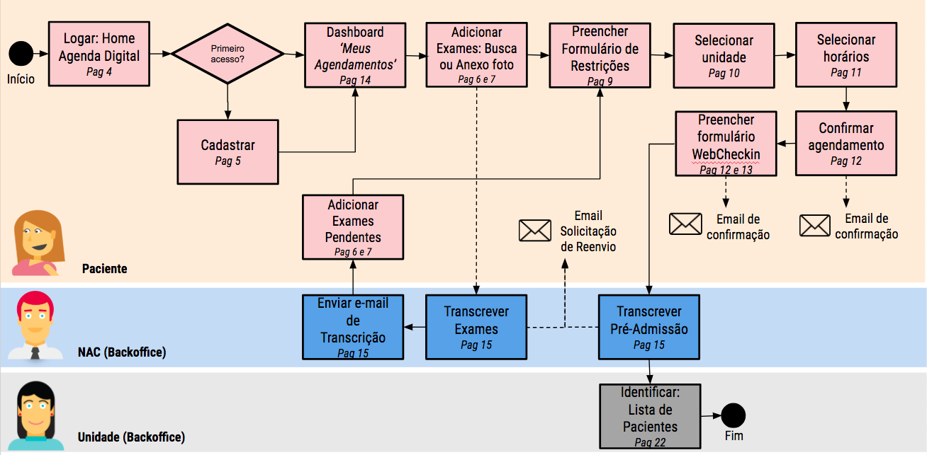
Design a mobile website for patients to schedule their laboratory tests.
The goals were pretty clear, we had a) to provide the best experience for patients and b) to reduce the company headcount.
Despite all the patients needs, I understood early which would be the hardest side to figure out: the business needs & requirements.
Healthcare is one of the most complex and regulated industries, and with all theses constraints, we started ideate the best experience.
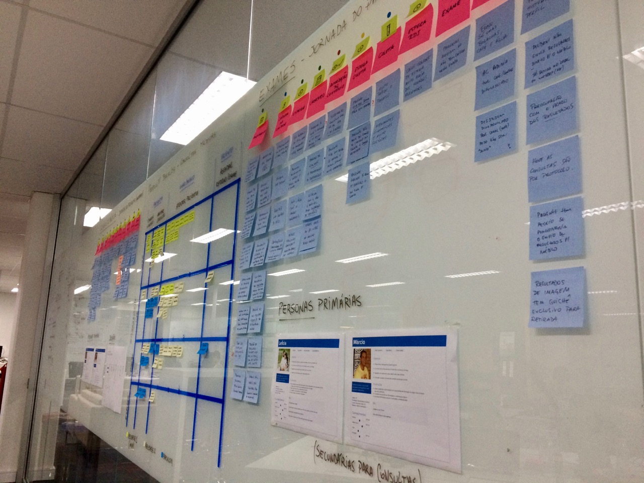
Understanding the patient journey
Designing the solution
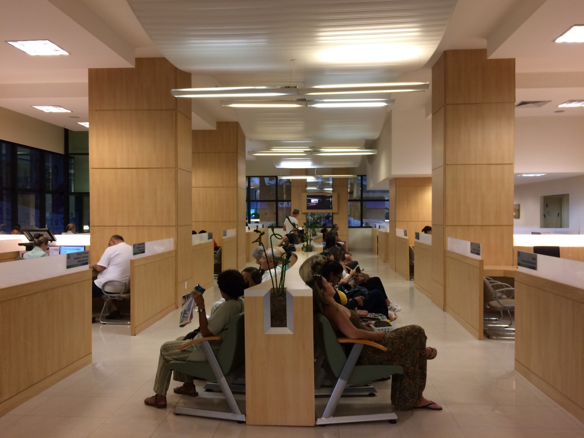
After some weeks of inception, visiting labs in different locations in Brazil, many co-creation sessions, prototyping and user testing, finally we had our validated MVP. Therefore, let the dev sprints begin!
Many sprints and releases later, this service is fully working and helping thousands of people to schedule their lab tests, in a seamless and quick way, with no waiting on the phone and no queues on the labs.
And we’re still improving it through user researching, data analytics, A/B testing, and many insights generated by tools like Hotjar and usability testing.
Next mission:
Explore the hospital ecosystem and discover opportunities to improve the routine of doctors and patients.
Our client has labs working inside hundreds of brazilian hospitals, and we could know the main problems and pains of doctors and patients of the biggest hospitals of this group.

Workshop for mapping stakeholders
After deeply understanding the hospital & lab ecosystem with the client participation, through stakeholder mapping and the service blueprint, we could start clustering and prioritizing the problems.

Service Blueprint

Stakeholder map of Hospital & Labs
Then we decided together to start developing solutions for the main problems doctors have, related to the laboratory tests.
After some co-creation sessions with the team, involving all the stakeholders, at last we prototyped two different solutions:
-
- a mobile app to keep doctors up to date about patients tests.
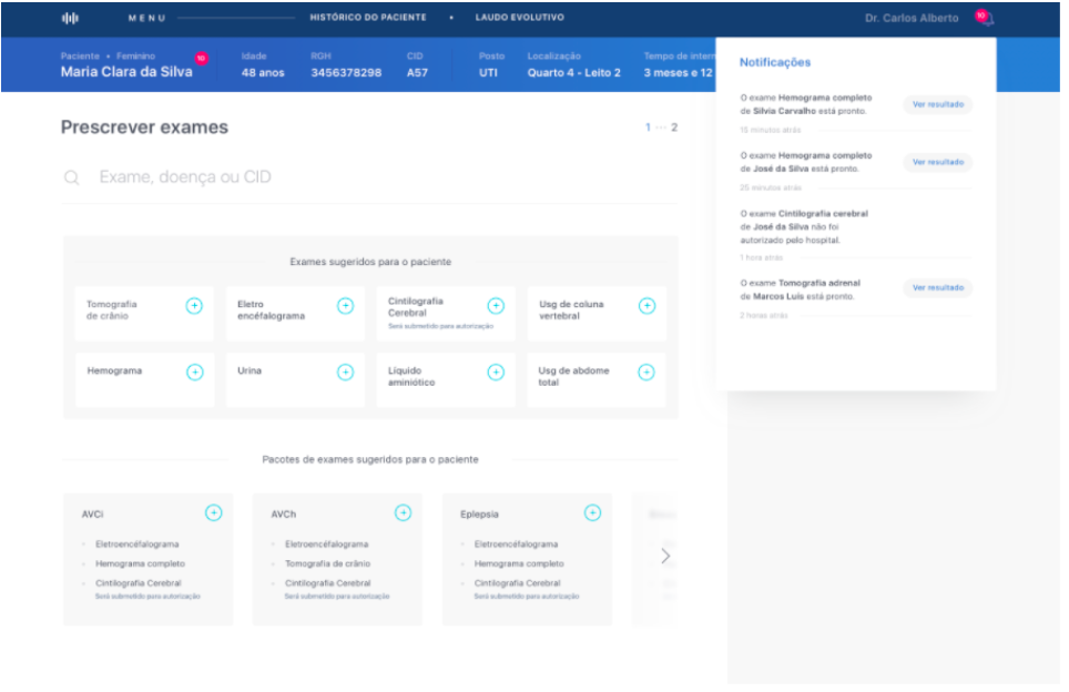
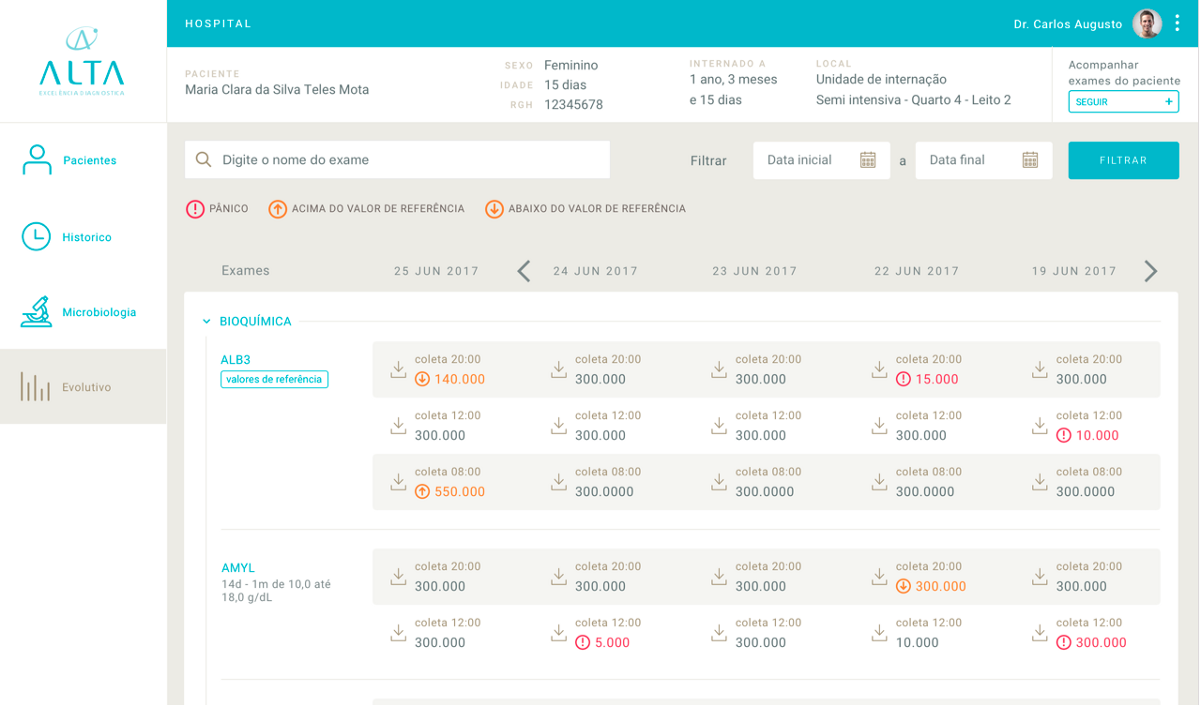
- a web plataform and dashboard for doctors to explore their patients history and to request lab tests.
Designing the solutions
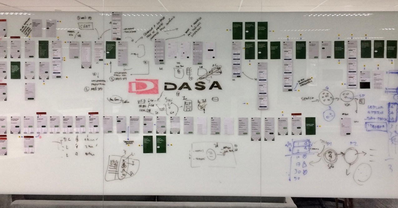
Some low fidelity prototypes generated in co-creation sessions.
Many cycles of prototyping and testing.
After many iterations and user testing, we reached great results, then let the dev sprints start.
*UI Design made by the team.
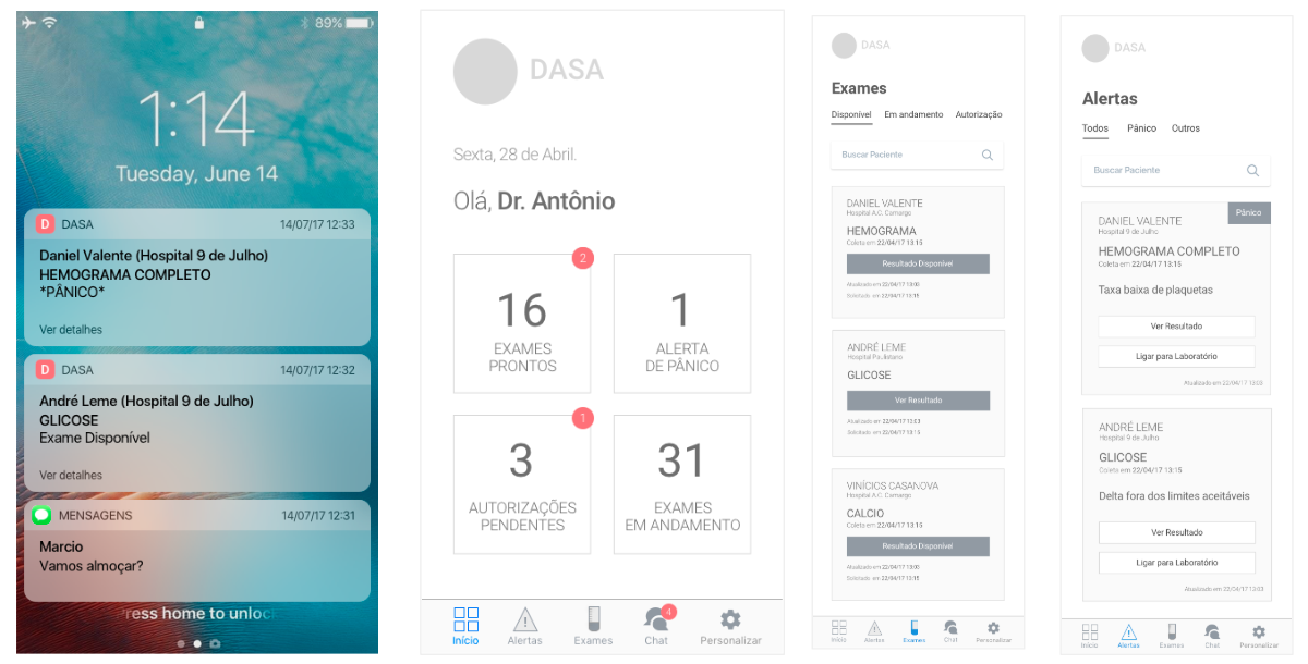
Mobile App final design
Mobile app for Doctors to consult patient’s tests results and get push notifications about the status of tests.
*UI Design made by the team.


Last mission:
Provide the best experience for Customer Service agents and patients
More than 2.000 agents using 20 years old software. The legacy software and information management were the main complaints, what affected so much employees and patients.

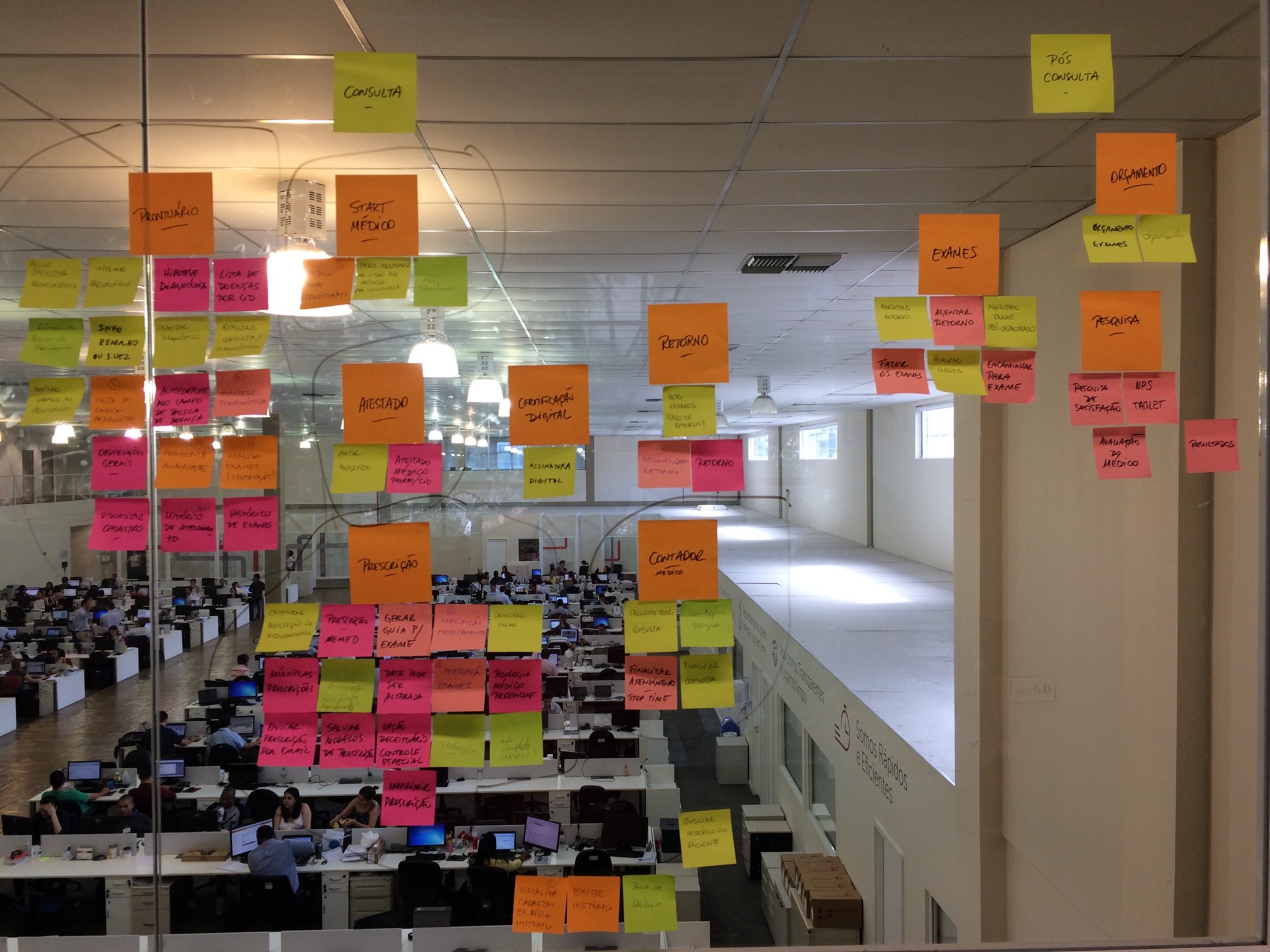
Mapping the Service Journey with stakeholders.
During the inception, I learned how they worked and what they needed.
I listened customer calls, interviewed stakeholders, performed cardsorting analysis, analysed previous customer researches and got hundreds of responses for my users survey.
Then we performed a workshop with stakeholders in order to define the service blueprint, to everyone understand where the main problems were and how to explore the opportunities to improve the service.
So many insights from the inception inspired us to get started the product conception.
These are some insights from the user survey (400+ responses).


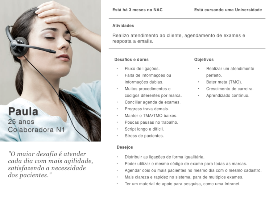
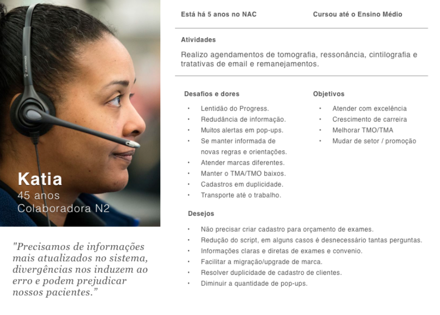
Two personas were created, based on the user research.
Then we prioritized the main features, first using a simple impact vs cost matrix, and after using Kano Model to prioritize it based on users input.

After many co-creation sessions, dozens of prototypes and usability testing, we got our MVP.
Here are some screens of the Customer Service web plataform.
*UI design by the team.
What’s next ?
